Overview
Loading state is used to convey the need to wait some time for a software- or hardware-related operation to complete. They can be used for a range of ongoing processes, including network, disk and CPU operations.
Guidelines
- Apply 300ms delay before showing loading state
- Guarantee that loading state will be visible for at least 400ms once shown
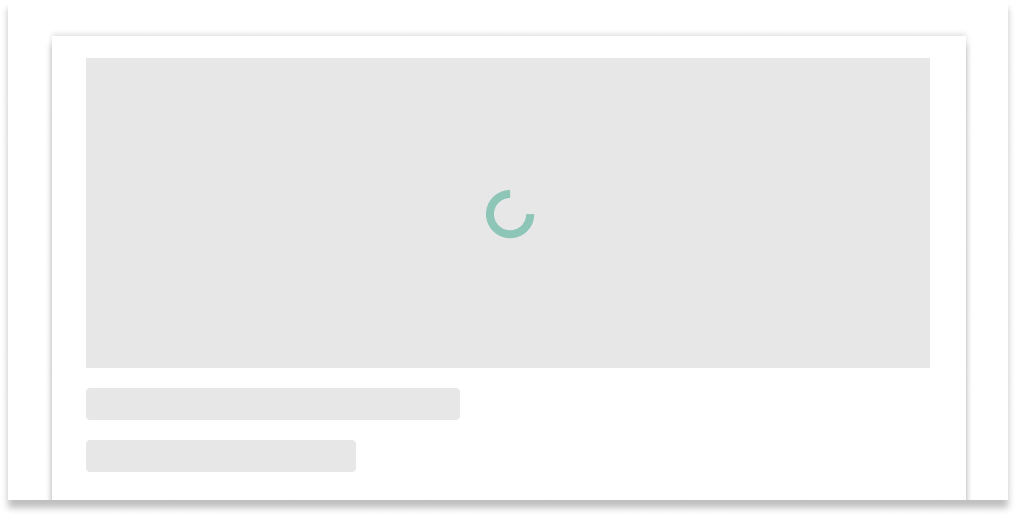
- For card grids, utilize loading skeletons
- In other cases, use circular or linear loader according to the usages below
-
When switching between a loading indicator and another component via
v-if/v-else, utilize useKShow with KTransition
Delay
Displaying loading state for fast operations can cause visual disruption resulting in worse experience than showing nothing at all. To avoid this, wait 300ms before showing a loading indicator.
KCardGrid's loading skeletons already have this behavior implemented by
default. KCircularLoader and KLinearLoader provide the
delay prop.
Minimum visible time
After a loading indicator appears, it should remain visible for at least 400ms before being replaced by content to prevent a brief flash of loading state causing a jarring visual experience.
KCardGrid's loading skeletons already have this behavior implemented by
default. KCircularLoader provides a minimumVisibleTime prop.
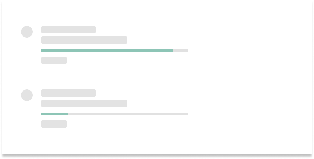
Linear loaders
Linear loaders illustrate progress by moving an indicator along a horizontal track. There are two types of linear loaders:
- Determinate: these loaders show a visual indicator of detectable and measurable progress percentage
- Indeterminate: these loaders show an ongoing process with an unspecified or undetectable percentage completion
Use KLinearLoader.
Usages
Use linear loaders for the following:
- Loading initial page content
- Representing the progress of a measurable task
Append linear loaders to appbars to load page content
Place linear loaders near information related to the task being measured
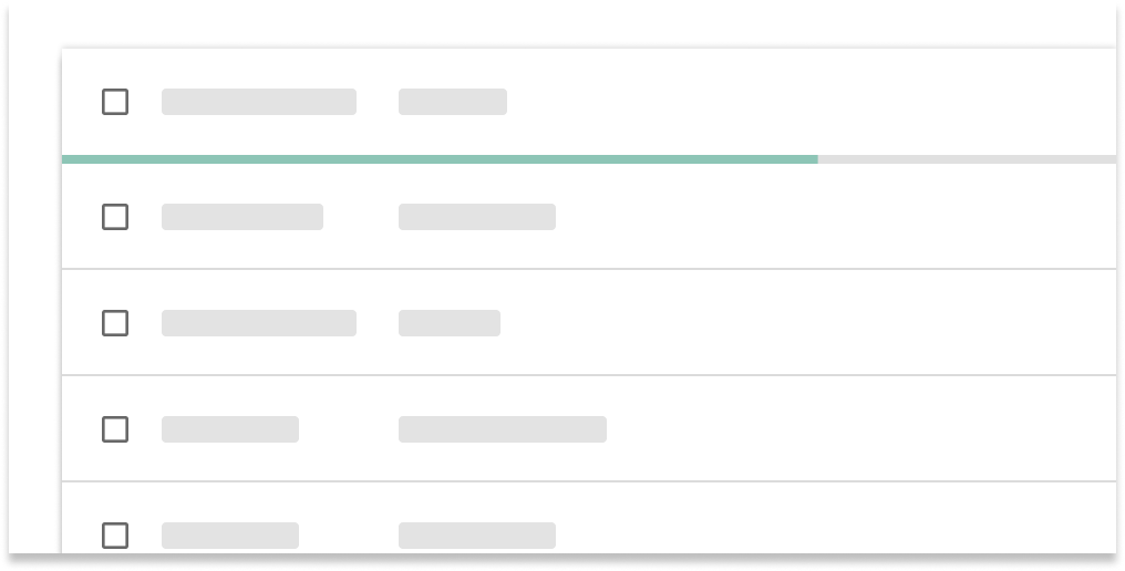
Append linear loaders to data tables
Specification
-
Track color:
palette.grey.v_200 -
Indicator color:
tokens.loading - Height:
4px -
Corner radius:
2px. Remove the corner radius when appended to other components, such as appbars or data tables.
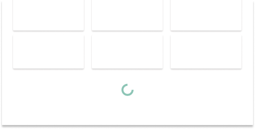
Circular loaders
Circular loaders illustrate progress by moving an indicator along a circular track.
Use KCircularLoader.
Usages
Use circular loaders for the following:
- Loading learning content renderers
- Indicating the presence of a working background task (can routinely appear and disappear)
- Loading a set of new information
- Pull-to-refresh behaviors on mobile
Place below existing content to indicate where new content appears
Center circular loaders when loading new information
Do not break the flow of information or content by placing between items (e.g. list items, content cards, table rows)
Specification
-
Indicator color:
tokens.loading - Dimensions do not exceed 48x48px
- Width:
4px
Related
KCircularLoaderis a circular loaderKLinearLoaderis a linear loaderuseKShowmanages the display of loading indicators and content when switching viav-if/v-elseKCardGridprovides loading skeletons